Banner-Sizing Rules
Banners are used on every important page of ScanSource's website. They’re a powerful tool for introducing and displaying various types of content. Banners consist of four major components: a background image; a title; a place for copy or text; and a link button. These examples are discussed below, as well as how to set them up on pages correctly.
-
Title
-
Logo Title
-
Title and copy
-
title and link
-
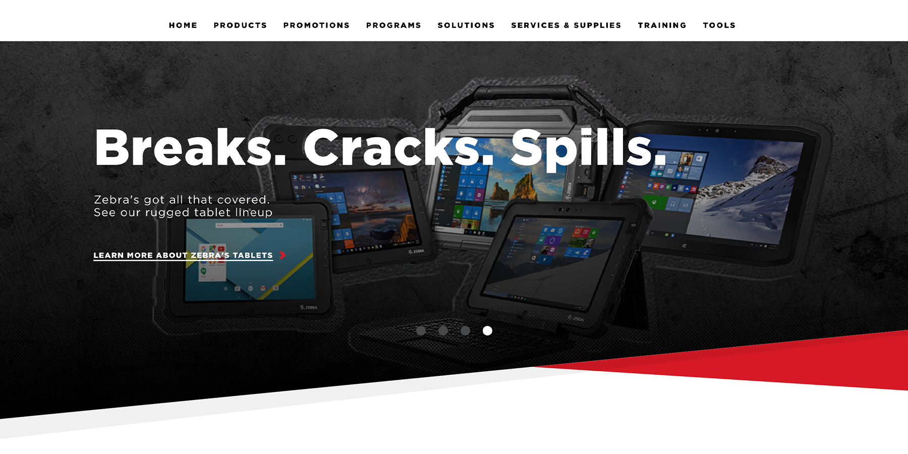
title, copy, and link
The most used banner on ScanSource’s website is the banner with only one title. Our H1 size is standard for all banner titles across our site and, if selected, the character limit is between 20 and 28 before the copy carries over onto the next line. There are cases where three lines of H1 title are used, but this is not preferred. When possible, keep the title short enough to stay on a single line in desktop view. If a longer title is necessary, then try to make it more than three lines. A tip for including a lot of copy at the top of the page on the banner—without having to abandon any of it—is selecting a phrase from an original title that’s long and then including the full version in the copy space below, as shown in the next tab (LOGO TITLE).
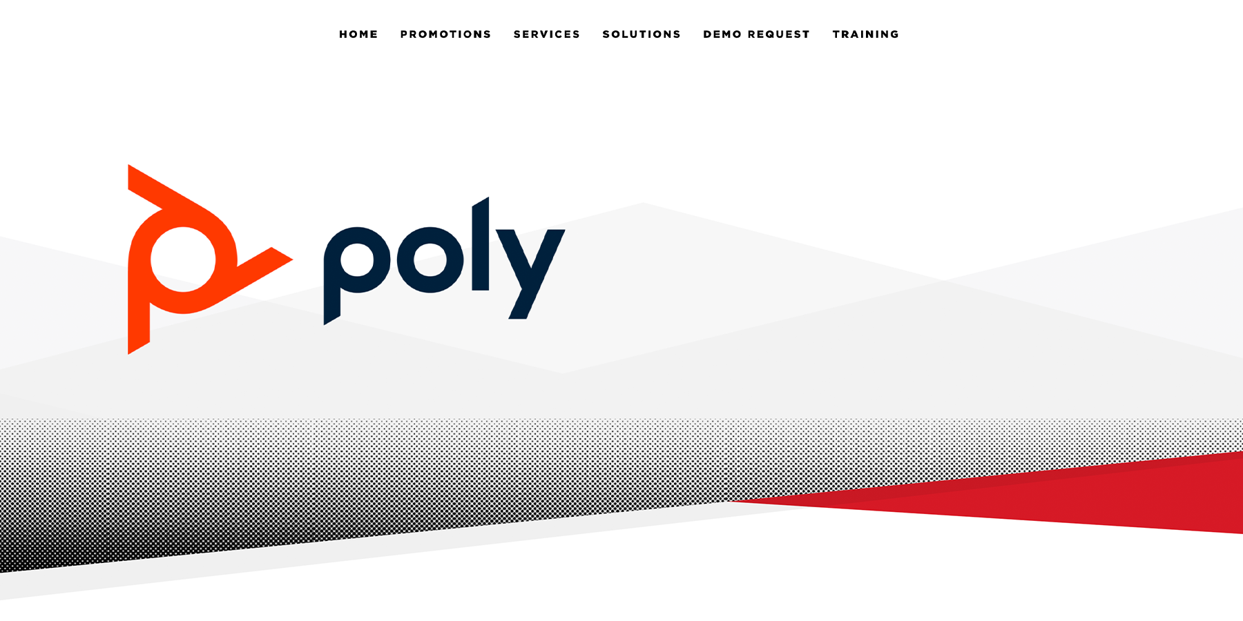
This version is similar to using just a title. This is most commonly used in our supplier microsites, where an identical neutral background is used for all and there are rules in place to keep the logos from extending past a specific size. The two ways to achieve including a logo in the header are as follows: 1. you can go into the text editor of the title or copy in the header banner and click on the image icon towards the top right, where you can search through the files in the media library and choose which logo or image you'd like to insert. 2. When creating a new "Brand Microsite Home" page, it will automatically include a banner with the logo element pre-included. From there, you will be able to then repeat the process previously laid out for choosing a logo from the media library.
If a banner needs body copy to accompany the Title, there are several things to consider. First, it becomes all the more important that the Title stay above 3 lines and preferably at just 1 line. Second, assess whether or not there will also be a link in addition to the title and copy. If it will show up without a link, then it is possible (although tedious) to include up to 5 lines of text. If title, text, and link will all be present, however, then try to keep the copy at 3 or fewer lines. Third, make sure that the copy is concise enough to not keep the readers’ eyes on that slide for too long, so as to not distract from other content on the page.
The purpose of including a link in a banner is never to distract from the page at hand, but to enhance it and build upon the content already present. Common usages for links in a banner are as follows: links to a PDF or file that has been discussed or mentioned in the banner text, an internal link to another page on the site, or an external link to one of ScanSource’s suppliers’ websites.
As mentioned previously, including a title, body copy, and a link will take up a lot of space on the banner, so it is important to keep everything as minimal as it can be. Try to keep the title to a single line, try to keep the body copy in 4 or fewer lines, and make sure to not have too long of a description for the link.
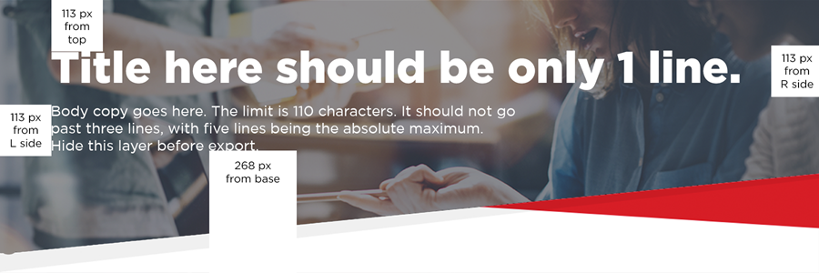
Banner Template
The standard size of images in our banners is 1800px by 600 px. Our banners all have a built-in dark gray overlay on them so that no matter how bright the image is, the white text above will always be legible.
If you are unsure of how your title, text, and link will look above the image, we have included a template in which you can place your image and text to see how all of the content would look before actually creating the page.
